Key Businesses
- HOME
- Key Businesses
- Marketing

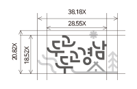
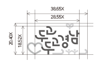
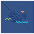
Gyeongnam tourism slogan
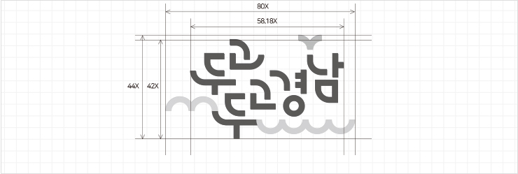
Concept of BI
It encapsulates the image of Gyeongnam’s eco-tourism while retaining the nature in the typo logo made of the images of mountain peaks, waves of sea and rivers, and birds, by using the lines.

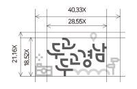
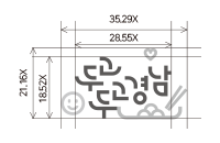
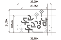
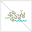
BI expandable design
The illustration of the slogan “Gyeongnam, where we have hoped to visit for so long” contains various things which we want to see, eat, enjoy, rest and feel. By using the expanded logo, we illustrate the diversity of tourism..
- See

- Eat

- Enjoy

- Rest

- Feel

Regulation on the BI colors
The color of BI uses a color designated below as the basic Color. Therefore, when each color is used, the designated and the correct color are achieved. Additionally, in the printing process, the following regulations are complied with.
[Main color]
- Main Color 01
- C100 M85 Y30 K10
- R0 G54 B114
- Main Color 02
- C0 M50 Y63 K0
- R243 G154 B93
- Main Color 03
- C43 M5 Y75 K0
- R162 G197 B94
- Main Color 04
- C70 M5 Y11 K0
- R30 G176 B218
[Sub color]
- Sub Color 01
- C0 M35 Y85 K0
- R248 G182 B45
- Sub Color 02
- C0 M60 Y20 K0
- R238 G134 B154
- Sub Color 03
- C45 M70 Y8 K0
- R156 G95 B156
- Sub Color 04
- C23 M32 Y53 K0
- R205 G176 B216
[Black, White]
- Black Color
- C0 M0 Y 0 K100
- R35 G24 B21
- White Color
- C0 M0 Y0 K0
- R255 G255 B255
Regulation on prohibition of BI application
The following examples show the use of deformed BI shapes. Referencing the examples, the user must ensure that there is no deformation in the BI.
Regulation on the use of background color
 Use of color other than specified
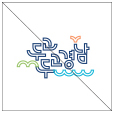 Handling it with lines
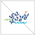 Twisting the shape
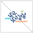 Random change in color combination
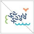 Random combination in proportion and spacing
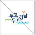 If other fonts are used in the logo
Background color of the same colof as the logo cannot be used.
 Use of color other than specified
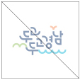 No lowered clearance of logo
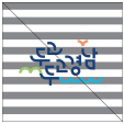 No application of complicated graphic elements
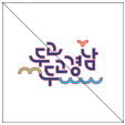 No expression of outline on logo

Tourism Information Live Chat

Open KTO Live chat (Downloading not) required


